

January 2014
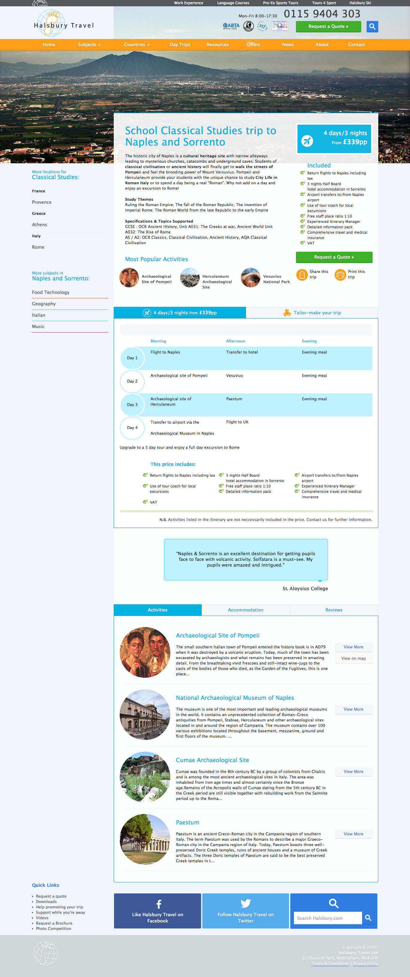
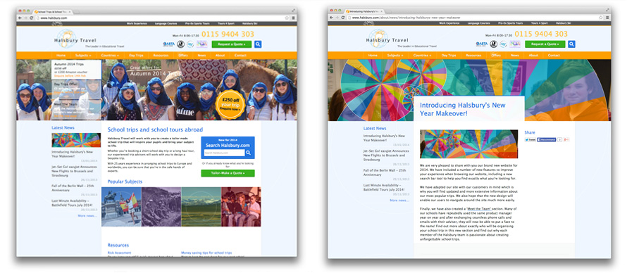
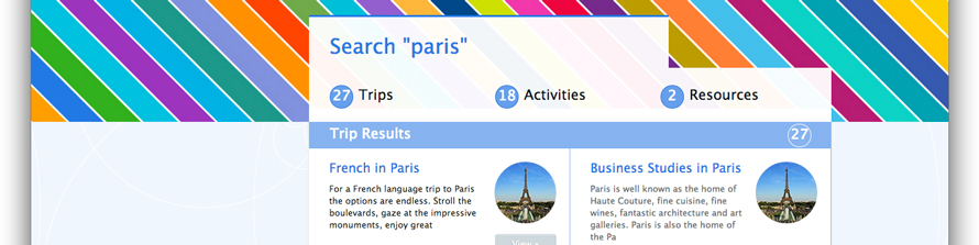
The flagship site of the Halsbury Group had a strong back-end system in place, providing customers with a wealth of options for their educational tour. However, the comprehensive site had yet to receive a design eye - one that made such an abundance of information seem manageable, and one that visually expressed the excitement of venturing abroad to learn.
After 7 months at the company, it was my task to re-skin the site and bring it up to screen-agnostic standards, in a project nicknamed Halsbury 2014.
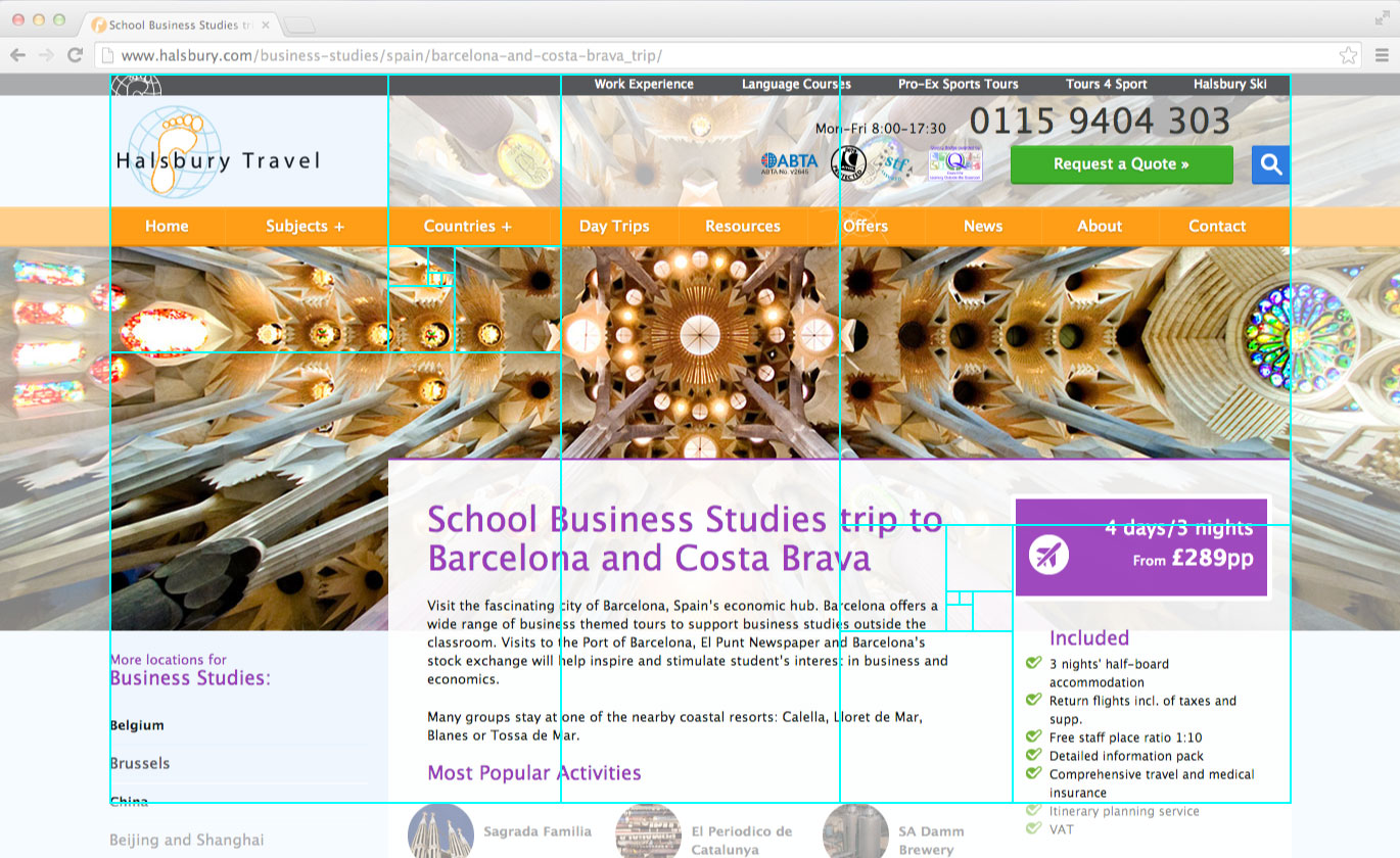
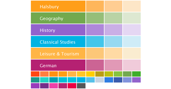
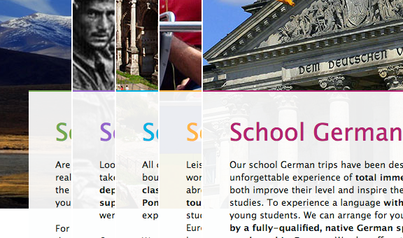
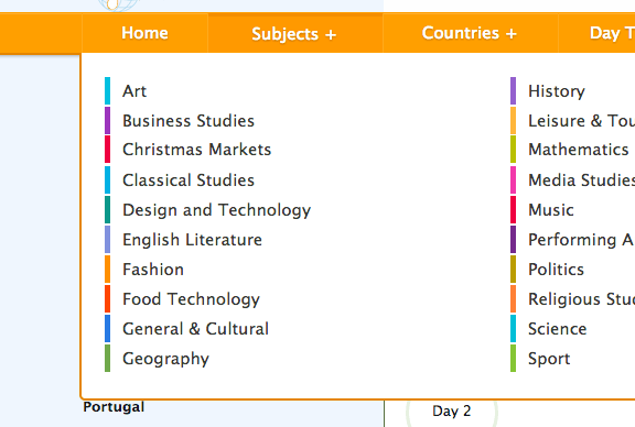
Colours carefully selected to harmonise with the Halsbury orange were associated with each of the subjects that Halsbury Travel currently offers tours for. These allow clear, playful navigation of the site and a sense of identity on each of the subjects' homepages. Drawing focus away from the main homepage and onto the more likely landing pages of subject tutors required the cultivation of a visual 'family', sharing elements but toned differently.
CSS3 transitions were used to add an engaging depth to the layout of the site in modern browsers, but since a vast number of Halsbury's customers remain confined to legacy browsers on aging machines, consideration had to be given to their experience. Hover-states were crafted such that when seen in tandem, they overcame the inherent jerkiness of no easing or transition time.

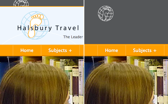
The Halsbury Group header at the very top of the page expands when hovered over to reveal links to the homepages of other companies in the Group.

Enough screengrabs


